A Surprisingly Important use for Reverse Flex Directions
Until now, I’d never found a good use for the column-reverse or row-reverse values for the flex-direction CSS property. I always felt it was odd that you would want to declare your markup in a specific order, only to have your users see it completely the opposite way around.
I can recall one time I wanted to use flex-direction: column-reverse as a ‘hack’ to help me integrate a third-party library’s component into my app, only to then be dismayed when (by default) the tab-order of focusable elements respected the order in the DOM, not the order the elements were rendered in. This made it entirely useless to me at the time, because I wanted my users to be able to navigate through my website in the correct order.
In fact, the MDN Web Docs website cautions you against using the *-reverse values in a page section called "Accessibility Concerns" for similar reasons. In the section they say:
Using the
flex-directionproperty with values ofrow-reverseorcolumn-reversewill create a disconnect between the visual presentation of content and DOM order. This will adversely affect users experiencing low vision navigating with the aid of assistive technology such as a screen reader. If the visual (CSS) order is important, then screen reader users will not have access to the correct reading order.
And for the most part, they’re right; using the *-reverse values to create the ideal visual order for your elements will typically short-change those using screen readers because they will hear (or feel) the elements out of order.
Except, I believe there is an exception; a design pattern where you specifically want to have your elements be visually in an order that makes sense for your sighted users, but be in the ‘wrong’ order for those using assistive technologies… And that exception is: form helper text.
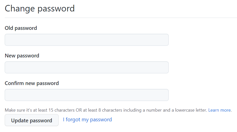
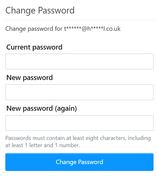
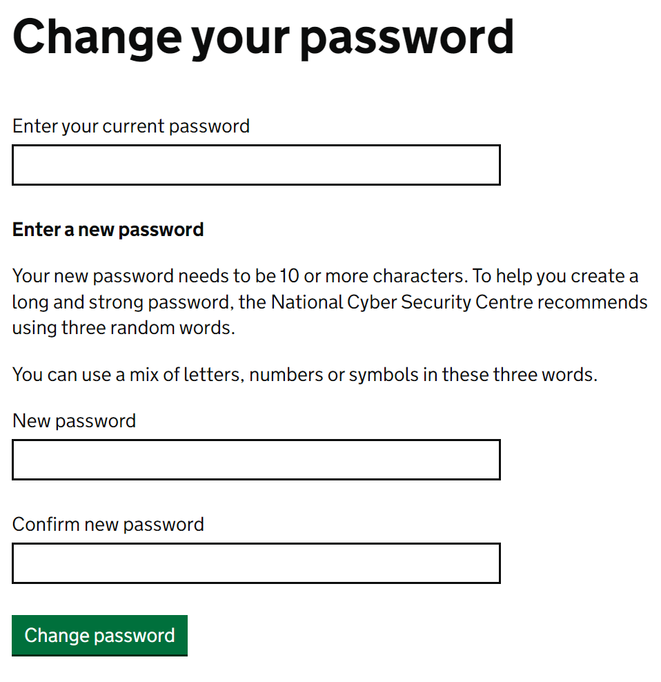
Look at the following password reset forms, they all have something in common.
GitHub

StackOverflow

Gov.uk

Each form describes to the user what criteria their new password needs to conform to. The first two examples, GitHub and StackOverflow respectively, do this after the “New Password” input fields. I would assume they’ve positioned the text there because that’s where they believe it looks the best while still being functional.
For able-sighted users, having this text after the inputs is no problem at all, our eyes dart around the page and anyone who wants to read that information will have no problem doing so before they enter a new password. However, the same is not true for those using screen readers. For these users, their readers will read down the page in order; the users will be told to enter a new password and will be presented with the new password input field before the user has any knowledge of the helper text below. Not ideal.
The third screenshot above is from the gov.uk website, a website well-known for having an excellent user experience (UX). They have the helper text placed above the new password inputs. I have zero proof, but I would like to think that they’ve done this to help those using assistive technologies see that information before they need it.
So what should you do if you both want your helper text below the inputs, but also want to remain accessible? Well, you’ve guessed it, this is where column-reverse comes in. You can achieve both goals by placing your helper text physically above the inputs in the DOM but wrapping them both in a div with flex-direction: column-reverse.
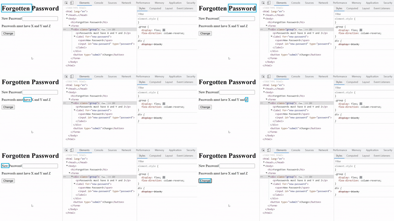
In the GIF below, you can see the Windows Narrator (a screen reader built into Windows) parsing a small webpage that I’ve written.

Note how it reads out the helper text before it gets to the new password input field. In the centre of the GIF you can see their position in the DOM and note that the helper text does indeed come first, even though it renders below the input in the document.
I finally have a practical use for flex-direction: column-reverse. I can’t help but notice the irony in the situation where a feature warned against for being bad for those with screen readers is actually a feature that can be used to help those very individuals, though it really does depend on how you use it.
Here I’ve only drilled down into a single use case, though I believe there must be many more. Another similar example could be error messages and/or alerts; perhaps those that appear near the bottom of pages should be read by screen readers sooner rather than later… There’s suddenly plenty to think about.